The colourbar tut by Arenas
First off, you need a new document. You can make it whatever size you want, but for the sake of easiness and a total peace of mind when it comes to making it look neat, I recommend 600 pixel width, 150 pixels height, a resolution of 100 pixels/inch, the good old RGB colour mode, with white contents. Hit OK.
Okay, you have a sig shaped bar. That was easy right? Are your rulers showing?

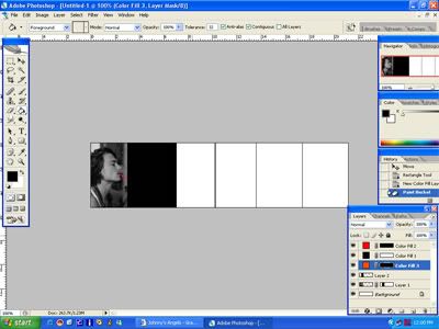
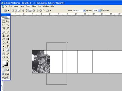
If you don’t see a ruler, hit Ctrl-r, or go to the tool bar, select ‘View’ and click ‘Rulers.’ Now I was a weenie and neglected to show what button to push, but select the line button so that you can segment your bar into six different sections. Before you do so, though, make sure this button is selected:

That’ll make sure that you have one layer for all your lines and not a layer for every line. That’s a pain to keep track of, trust me. But, the cool thing about having a ruler in view, is that you can follow the notches to get neat, even lines every single time. Click the mouse once the courser is lined up with an inch mark on your ruler, press the Shift bar, and drag downwards. Repeat this action with every inch marker until you’ve got six segments like the pic above.
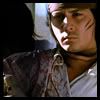
Now for the hard part, picture selection. It helps to do this beforehand, just as a matter of preference. Creative license is key! Here’s my first pic:

This is where it starts to get tricky, so bear with me. Locate your layers pallet and you’re going to need a new adjustment layer. That’s the button with the circle that’s half white and half black. Click ‘Solid Colour.’

When the colour window pops up, select black (000000) or white (FFFFFF) and hit OK. You’ll have an entire layer of black or white. Oh no! But not all is lost, friends. Relocate your layers palette and make sure your new layer is selected. Go to the drop down menu at the top of the layers palette and select ‘Colour.’ Your picture should be back and not only that, but in black and white. Cool, huh?

Now, select the layer that contains the picture itself, not the black/white layer and not the layer with your lines. The original, untouched pic. Create a mask for that layer (the little button with the circle in the box).

Remember the line tool? Go back to that button, click and hold until you get a bunch of options. Pick the box tool. This is for neatness and to make sure everything lines up perfectly.

***Make sure the mask is selected and not the pic!*** It should have a white box around it! We’re trying to preserve the original pic, you see, so that if we mess up, the project is still salvageable. Now, once the mask is selected, make sure black is the colour on top of your colour boxes.

Now, draw a box over the area that is outside the section that you want the pic to occupy.

With any luck, this should be how your colour bar and that layer looks in the pallet.

Now, select your layer of black. You’re going to need a new adjustment layer, another Solid Colour.

Select some form of red. I’m a bold sort of person, myself, and prefer just the regular, flashy FF0000. Once you’ve picked your colour (it should completely flood your colour bar, not to worry), hit OK. That red layer should be above your black layer.

Your red layer should have the mask selected as the default (if it doesn’t, something may very well be seriously wrong with your PS). Select the fill bucket tool and fill that clayer completely with black. The red should disappear, leaving your original black and white photo from step somewhere up there.

Now for the fun part. Select the brush tool at a small number. Small enough to get into nooks and crannies and tiny little stuff. Select white (still on the red layer) and start brushing the area you want to appear red in your final pic.

It’s gonna take some time, but it’s so worth it. Once you’re finished, leave your red layer selected and go to the drop down menu in the layers pallet. I circled my favorite choices when it comes to applying the colour, but experiment. See what works best. It’ll come out pretty darn spiffy.

Now, select your red photo (and I apologize for not labeling the layers, but it should be the first one that’s not the background layer). This is the point where you should have your orange pic ready to roll. Paste the orange pic above the red pic and rearrange it until it is placed to your liking. Because the layer is beneath the black layer, it should be black and white too. This is what the pallet should look like by now.

Remember the step where we blocked out the red pic’s edges? We do the same thing here. Make a mask for the orange layer, make sure it is selected! Select the box tool and make the colour be black. Block out the boundaries of the orange pic so the it doesn’t ooze into another pic’s space.

Make a new Solid Colour adjustment layer and select a good orange colour (FF7000?). See where this is going? It gets really easy (if a bit time consuming) now.
For reference, this is a very good rule of thumb. Your black layer is your dividing line. All your pics go BELOW the black layer. All your colours go ABOVE the black layer. Savvy?

Black out your orange layer mask. Select white as your colour and begin to brush on the orange mask the areas you want to be orange. Go back to the drop down menu and play around with the settings until you get a combination that you like. Also, if you happen to mess up by accident, colour a little too vigourously, etc, you can go back in with the brush in black and colour over the accidents.

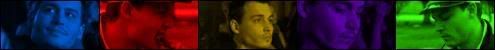
Now that you have the basic knowledge to complete your colour bar, feel free to do so. This is what I got, if a bit haphazard towards the end. The colours I used were red (FF0000), orange (FF7000), yellow (FFF000), green (00FF00), blue (no idea, but I recommend 0000FF) and purple (FF00FF).

You can leave it at that, slap on some text and call it done, nothing at all wrong with that. It’s quite fetching.

These next few steps are for the truly adventurous (and those whom I didn’t completely lose along the way). First off, DON’T FLATTEN YOUR IMAGE!
Duplicate it instead. Image -> Duplicate.

Make all your colour layers invisible (thus the not flattening).

However, now that your pic is now completely black and white, you may now flatten your image. Layer -> Flatten Image

Now we’re going to blur it and make it fuzzy. Go to Filter -> Blur -> Graussian Blur. Set it to 2 pixels (or thereabouts, please experiment).

Once it’s all blurry, hit Ctrl-a and Ctrl-c. Or, for the shortcut challenged, Select -> All and then Edit -> Copy. Paste your blurry copy into your original pic below your colour layers but above your black layer.

Set the fuzzy layer to Overlay in the drop down menu in the layers pallet. You’re going to get a really glowy, soft and surreal picture and it’s a real shiny effect.

The only problem is that it has effectively blurred out your hard coloured items. That’s not so shiny. This is the tedious part of the technique, but it’s not all that bad. It’s really just a repeat of an earlier step. Make a mask for the fuzzy layer and keep that mask selected. Pick black as your colour and a tiny brush, and then go in and black out your coloured areas.

You just have to be careful about over colouring. It happens, but it looks kinda funky when it does, so it’s probably a good idea to fix it.

Here’s the difference between the two:

It’s really just a matter of preference. Play around with settings. Experiment. Run wild and all that jazz. I look forward to seeing what you guys come up with.


 )
)